Onduo
Visual Identity | Guidelines | Web Design
Say hello to your easier-to-manage diabetes life. Onduo gives you tools and coaching that help diabetes patients live a healthier lifestyle.
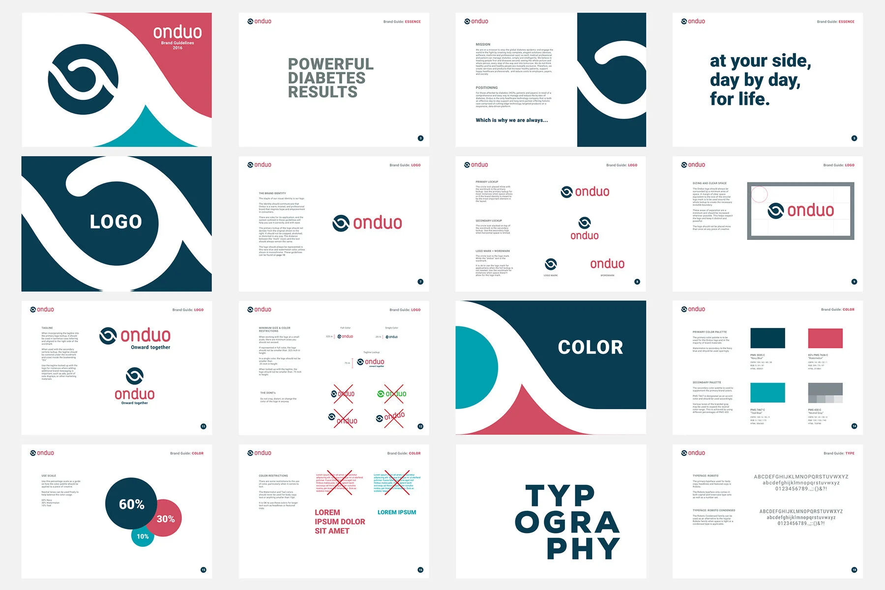
In a crowded healthcare market, Onduo needed a brand identity that would distinguish their product from the competition. After completing a competitor audit of the space, it was clear the identity and branding needed a fresh approach that veered towards warm and friendly instead of `clinical,” appealing to consumers and healthcare professionals alike. We set out to leverage the name Onduo to visually capture a sense of partnership.
Playing up the sense of frictionless-ness, the logomark uses an abstract visual metaphor of a wave, which is simultaneously powerful, gentle, flowing, and inspiring. Paired with a lowercase, rounded wordmark, in a bold “watermelon” color, the identity inspires in viewers a sense of hope and optimism while remaining professional and iconic.
This concept set the foundation for the rest of the look and feel that built out the brand guidelines.
We took this a step further and developed a launch site for the new brand while they built up the company and on-boarded patients. Onduo then went on to roll out their initial product offering, applying the brand to their welcome kits, patient portal, and second gen website.


