Enchroma
Brand Strategy | Identity Refresh | User Experience | Packaging
Enchroma envisions a world where every person has access to the full spectrum of color and therefore the full spectrum of life.
With a product that instantly created a viral sensation, Enchroma’s reputation grew quickly—as did their need for a more mature brand. Our goal was to elevate it to that of a global lifestyle company that stood for transformative color science.
We started by doing an audit of their current brand and how it compared with the new brand strategy that we created in collaboration with the leadership team at Enchroma.
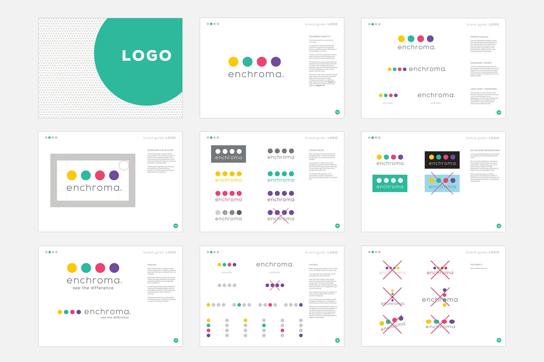
We noticed a blind spot, so to speak, in their former color palette—the hues looked brown and muddied to color deficient eyes. This was an excellent opportunity to not just refresh the logo, but to actually make it more usable and useful to their customer base.
Working with two of Enchroma’s own employees with color blindness, we developed a palette that was not only pleasing to their naked eyes, but one which had a profound transformation when viewed through Enchroma’s lenses.
We then extended this concept to play-out through all user touchpoints. The updated logo was inset in iridescent steel to reflect the transformation right on the product frames. We developed an interactive packaging design to display an emotional world of color right out of box, utilizing the most transformative purple tone throughout, along with a first-time user guide to help enhance the experience.
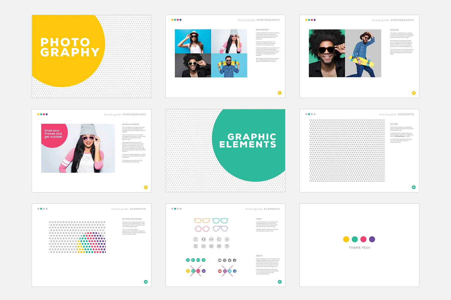
We also worked with the Enchroma team on updating their website and style guide with the new identity, color palette, and photography, while creating new brochures, in-store displays, and of course brand swag to launch the updated look.


